
Custom patches sizing, color, and texture influence how a badge reads at a glance across fabrics and lighting. Understanding patch color guidelines helps ensure contrast and brand clarity, even on busy textures and diverse garment colors. Patch texture options—from embroidery density to PVC finishes—can add depth while preserving legibility in real-world wear. When you plan how to size patches for clothing, you’ll also consider backing choices and the tradeoffs between iron-on vs sew-on patches. Prototype tests and practical feedback let you refine sizing, color, and texture so patches remain readable and durable on every product.
Think of patch design as a package of dimensions, hues, and surface treatment that works across fabrics and uses. In this framing, patch sizing becomes dimensions and scale, color decisions become tonal strategy, and texture becomes tactile depth that helps recognition from a distance. For brand teams, achieving consistency means documenting embroidery density, backing types, and finish options in a shared style guide, whether you’re using sew-on badges or heat-pressed alternatives. By using related terms such as texture options, padding effects, and color harmony alongside core concepts, you cue search engines with semantically related ideas and improve discoverability for designers and suppliers.
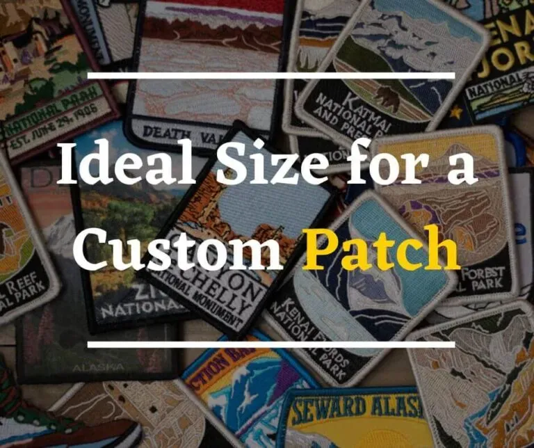
Sizing for Maximum Impact: How to Size Patches for Clothing
Size drives readability and visual balance. When designing patches for apparel, the garment type and viewing distance should guide the patch dimensions. For everyday wear like T‑shirts or hoodies, patches around 2 to 3 inches square (about 5 to 7.5 cm) typically strike a balance between visibility and subtlety. On jackets, backpacks, or hats, a 3 to 4 inch patch (about 7.5 to 10 cm) can serve as a strong focal point without competing with other branding elements.
Beyond mere inches, consider the viewing distance and the patch’s shape. A square or circular patch offers stable perception, while banners or elongated shapes can better accommodate longer messages. Leave a 1/8 to 1/4 inch (3 to 6 mm) seam allowance and place patches to avoid high-wear seams. Prototyping with multiple sizes on the actual fabric enables you to evaluate readability, fabric interaction, and motion wear, then refine using feedback and real-world testing pose constraints.
Color Guidelines and Contrast: Patch Color Guidelines Across Fabrics
Color choice directly impacts legibility and brand recall. When you weave Custom patches sizing, color, and texture into the design, ensure color choices reinforce intent and stay readable against the garment color under different lighting. Colors that look vibrant on a screen can appear dull on fabric, so early color testing is essential.
Key strategies include maximizing contrast between foreground design and the patch backing, building palettes with the garment in mind, and using a color bible to maintain consistency. Testing colorways with proofs and fabric swatches helps catch issues before production, ensuring the final patches look intentional on store lighting, daylight, and indoor environments.
Texture Choices that Elevate Aesthetics: Patch Texture Options
Texture adds depth and perceived quality. Texture decisions—such as embroidery density, backing material, and material type (fabric, PVC, enamel, leather, etc.)—influence visual impact and how the patch wears. Dense embroidery can improve legibility on small text, while options like puff embroidery introduce raised elements that catch light and draw attention.
Different substrates interact with fabrics in distinct ways. Classic embroidery offers a stitched texture; PVC patches provide a crisp, tactile plastic feel; woven patches emphasize finer text with a different texture profile. Finishes like merrow borders deliver clean edges and premium feel, while texture choices can help differentiate a brand across product lines without changing the color palette.
Iron-On vs Sew-On: Backing and Durability Considerations
Backing choice affects attachment longevity and care. Iron-on backing offers convenience for quick branding but can fail on silky blends, very dense fibers, or garments that undergo frequent washing. Sew-on patches deliver durable attachment, especially for workwear or items expected to endure regular laundering.
Other options, such as hook-and-loop (Velcro) backs, enable removable branding for uniforms or gear with evolving logos. Care considerations—washing, drying temperatures, and ironing guidelines—also shape lifespan. When using iron-on patches, test heat on a scrap fabric to avoid scorching and ensure compatibility with the garment type.
Custom patches sizing, color, and texture: From Idea to Production
Design-to-production is a repeatable journey. Alongside deliberate sizing, color, and texture decisions, establish a standard process that ensures consistency across runs. Create a standard-sizing chart, color palette, and texture profiles to guide every patch you produce, and document tolerances for size, color variation, and thickness so manufacturers can replicate motifs faithfully.
From vector artwork to proofs, prototyping, and final production, each stage should be tested on the actual garment and material. Color proofs and fabric swatches help verify how colors render, while physical prototypes validate alignment, texture, and wear. By maintaining a clear pipeline, you’ll always have patches that meet brand standards and perform reliably across product lines.
Common Mistakes and Real-World Examples: Practical Patch Design Lessons
Even seasoned designers can stumble when patch projects mix sizing, color, and texture. Common missteps include ignoring garment variability, which can affect backing adhesion or embroidery outcomes; overcomplicating text, which harms legibility at smaller sizes; and inconsistent color handling without a color bible. Each mistake risks diminishing readability and brand coherence.
Real-world scenarios illustrate best practices. For instance, a 3-inch circular patch on uniforms can balance readability with durability using dense embroidery and sew-on backing, ensuring longevity through frequent washing. Conversely, a PVC patch with a satin border on a backpack may deliver a modern look with robust color integrity and tactile appeal, demonstrating how careful choices across size, color, and texture yield cohesive branding.
Frequently Asked Questions
How should I approach Custom patches sizing for different clothing items (how to size patches for clothing) to maximize readability and brand impact?
Start with garment type and viewing distance. For T‑shirts and hoodies, aim for 2–3 inches square (about 5–7.5 cm); for jackets, backpacks, or hats, use 3–4 inches (about 7.5–10 cm). Consider where the patch will be seen from (2–6 feet for many apparel items) and ensure any text remains legible at that distance. Additional sizing guidance: use square or circular shapes for visual stability, leave a 1/8–1/4 inch (3–6 mm) seam allowance, and prototype several sizes on the actual fabric to compare readability, fabric interaction, and wear. This aligns with Custom patches sizing and how to size patches for clothing for consistent results. Specifically test across fabrics and adjust proportions to keep the patch in harmony with seams and natural lines.
What are patch color guidelines to ensure readability and brand consistency across fabrics?
Follow patch color guidelines that emphasize contrast, harmony, and colorfastness. Ensure strong contrast between the foreground design and the backing or garment color, test colors on actual fabric, and use proofs or digital renderings to verify appearance under typical lighting. Build a color bible with primary and accent colors and document acceptable variations. Use standardized swatches (Pantone or brand standards) to maintain cohesion across product lines, and validate colorfastness through multiple wash tests to prevent fading or bleeding.
What patch texture options are available, and how do they affect durability and appearance?
Patch texture options range from embroidery texture to PVC and woven surfaces, each with distinct looks and behavior. Embroidery density and techniques (e.g., puff or satin stitches) affect legibility and surface feel; material choices (fabric, PVC, leather, enamel) change drape, stiffness, and wash durability. Finishes and borders (merrow edges, dense edges) define definition and resilience on different fabrics. Consider the background color and fabric type when selecting textures to maintain durability and brand perception across product lines.
When should I choose iron-on versus sew-on patches for a given fabric or use case?
Choose based on fabric compatibility, durability needs, and care expectations. Iron-on patches offer quick attachment but can fail on silky blends, dense fibers, or garments that see frequent washing; sew-on patches provide stronger attachment and longevity for workwear or high-wear items. Backing options like Velcro can provide removability for changing logos. Always follow care guidelines: test heat settings on scrap fabric, and verify patch longevity through typical washing and ironing routines to ensure the best fit for the garment and use case.
How can I size patches for clothing to maximize brand impact across multiple product lines?
Develop a standard sizing chart and maintain consistent aspect ratios across lines. Start with a central, scalable patch size (e.g., 2–4 inches) and adapt slightly by garment type, then prototype on representative products to gauge readability and balance with other branding elements. Use a unified approach to shapes, spacing, and placement to keep brand cohesion while allowing small adjustments for specific products (e.g., caps vs. jackets). Document guidelines for sizing, proportions, and recommended minimums to ensure repeatable results in production.
How do I validate patch color guidelines and texture options together before production to prevent surprises?
Perform a combined check using color proofs and fabric swatches on the actual patch material, then test across multiple lighting conditions (store lighting, daylight, and indoor lighting). Create a sample batch to evaluate how color and texture interact on the garment, verify readability and depth, and confirm that borders and textures look consistent. Maintain a color bible and texture profiles for reference, and iterate with prototype patches until you’re satisfied with how color, texture, and backing work together in real-world wear.
| Aspect | Key Focus | Practical Guidance |
|---|---|---|
| Sizing | Importance of fit and proportion; readability and viewing distance across fabrics |
|
| Color | Impact on readability and brand recall; testing across fabrics and lighting |
|
| Texture | Adds depth and perceived quality; interacts with material and fabric |
|
| Backing and application | Attachment method affects longevity and care |
|
| Design-to-production | From concept to repeatable production; consistency across runs |
|
| Common mistakes to avoid | Frequent missteps in sizing, color, and texture |
|
| Real-world examples | Illustrative case studies for sizing and texture choices |
|
| Conclusion | Integrated approach to patch design |
|