
Color Theory in Embroidered Design is more than a pretty palette; it’s a practical framework for making thread choices that communicate mood, emphasis, and texture on fabric. When you understand how colors interact—contrast, harmony, and the way one shade can recede—you can design embroidery that reads clearly from a distance and rewards close inspection with nuance. Color theory embroidery guides you toward thoughtful thread color combinations that pop without shouting, whether you stitch on linen or canvas. A simple reference like the color wheel embroidery can help translate theory into tangible choices you can apply across projects. The result is a cohesive, expressive palette that supports the motif without overpowering it.
Beyond the basics, think in terms like color theory embroidery to plan deliberate palettes rather than guessing, a shift that makes your stitching decisions more intentional. Develop palettes that establish a clear path for contrast and gradation, then test on fabric swatches under the lighting where the piece will live so you can refine tonal relationships. The practical side of this approach is translating theory into doable steps—choose a dominant hue, add supporting tones, and consider how texture and fiber finish affect color. Shading in embroidery brings depth through careful value shifts and layering, ensuring highlights and shadows read naturally across stitches.
Mastering Hue, Value, and Saturation for Embroidery Palette Building
Color relationships in embroidery begin with hue, value, and saturation—the three axes you use to sculpt a palette that reads clearly on fabric. Hue positions the color family (red, blue, green); value guides brightness; saturation defines intensity. When you select threads, consider how these dimensions translate through fibers and stitches. A pale peach can glow as a subtle highlight on a dark ground, while a saturated emerald can anchor a motif. As you plan your design, sketch the relationships first: which color cues direct the viewer’s eye, and which tones support depth without stealing attention.
Translate these mechanics into practical choices: establish an anchor color, a supporting cast, and a single accent. Test the palette under the lighting conditions where the piece will live, because color shifts with daylight or indoor lamps. Use embroidery thread color combinations that emphasize value contrasts to carve form, and keep saturation in mind to maintain harmony. In this way, color theory moves from abstract theory to hands-on technique in embroidery.
Color Theory in Embroidered Design: Building Mood with Warm and Cool Tones
Color Theory in Embroidered Design frames mood and message as deliberate color choices. Warm hues like reds, oranges, and yellows create energy and forward motion; cool hues like blues and teals evoke calm and sophistication. When you want a focal element to pop, lean on warm tones against a cool background, or vice versa. This intentional pairing makes your piece convey emotion before the first stitch is examined.
Consider how fabric color and lighting influence perception. A copper thread on navy can feel modern and vibrant, while the same copper may appear muted on lighter fabrics. Use this interplay to craft a narrative—color becomes a storyteller rather than a ornament. By labeling your choices with a clear mood objective, you keep your embroidery from drifting into noise and preserve legibility from a distance and intrigue up close.
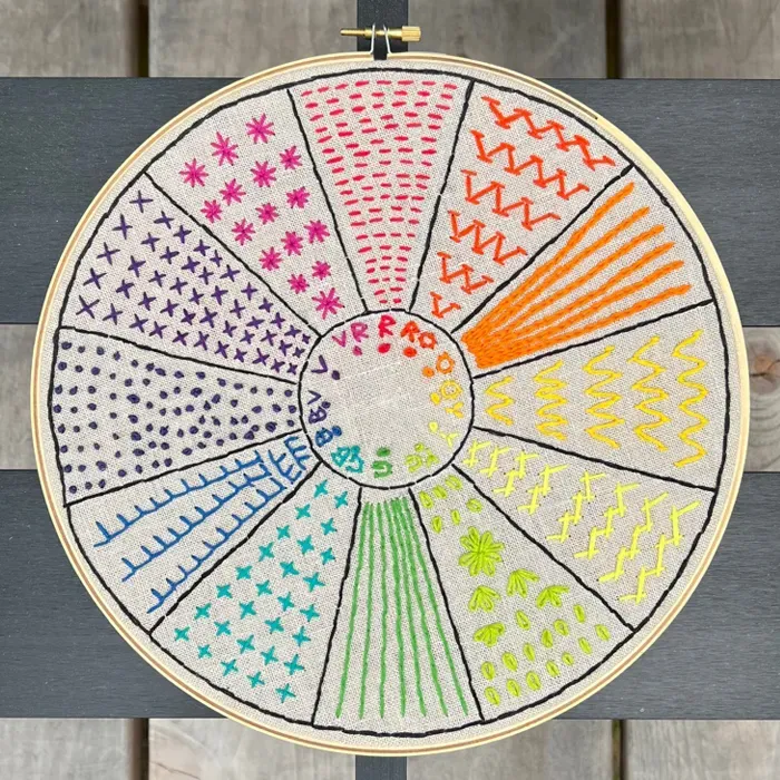
Color Wheel Embroidery: Translating Wheel Logic into Thread Choices
Begin with a base color from the color wheel and explore neighboring shades to build depth, or reach across the wheel for contrast. The color wheel embroidery concept helps you predict how a given thread will play with others as light changes. For instance, pairing a cool blue with a warm coral can deliver high drama while remaining cohesive, especially when you choose a mid-tone background to unify edges.
Keep practical rules in mind: test on the actual fabric, consider stitch density, and vary the hue while preserving a consistent value range. Variegated threads can add dynamic shifts, but use them with intention to avoid confusing boundaries. When you map palette relationships on fabric samples, you create a living guide you can reuse across projects, from delicate florals to bold geometric patterns.
Choosing Embroidery Thread Color Combinations with Contrast and Harmony
Creating embroidery thread color combinations that work means balancing contrast and harmony. Contrast helps focal areas read from a distance; harmony ensures the piece feels intentional rather than fragmented. Start with a dominant color, add one or two supporting colors, and reserve an accent for sparkle. This approach aligns with color theory embroidery principles and supports legibility across viewing distances. When possible, test contrasting thread colors to boost visual emphasis and ensure embroidery thread color combinations stay coherent.
Then refine by testing on the fabric under expected lighting. Observe how the threads interact with fiber texture, sheen, and stitch type. Use a few variations of value within each hue to sculpt form and shading without introducing new hues. The goal is a tuned ensemble where each thread color has a purpose and every contrast reinforces the composition.
Practical Schemes for Embroidered Art: Complementary, Analogous, Triadic, and Neutrals with Pops
Color schemes are the backbone of readable embroidery. Complementary contrasts create drama, analogous palettes deliver a soft flow, and triadic combinations energize designs without overwhelming them. A tetradic setup can add complexity while maintaining structure, and neutrals with a single bright accent keeps sophistication intact. When selecting color schemes, think about how embroidery thread color combinations will behave on the chosen fabric.
Experiment with real thread families—cottons for matte finishes, silks for luminous depth, and metallics for accents. The same hue can read differently with finish, ply, and stitch technique, so try several textures to find what best supports your motif. This exploration turns color theory into tactile texture and clear reading for both distant and close viewing.
Lighting, Fabric, and Shading in Embroidery: Reading Color on Different Surfaces
Lighting conditions dramatically alter color perception. What looks vibrant in daylight may drift toward warmth or coolness under indoor lights, and fabric color acts as a stage for every thread. Lighter fabrics amplify pale hues, while deep backgrounds can intensify saturated tones. When planning shading in embroidery, account for how textures and thread finishes reflect light differently.
To ensure color reads as intended, test palettes on the actual fabric and in the anticipated environment. Photograph progress under varying light, review digital and painted samples, and adjust values to preserve depth without sacrificing readability. With careful consideration of color wheel embroidery principles and shading in embroidery, you can craft pieces that maintain tonal integrity from gallery spotlights to casual home lighting.
Frequently Asked Questions
What is Color Theory in Embroidered Design and why is it important for embroidery projects?
Color Theory in Embroidered Design is a practical framework that helps you choose embroidery thread colors based on hue, value, and saturation. It guides mood, emphasis, and texture, ensuring colors read clearly from a distance and reveal depth up close. By applying these concepts, you can select threads that pop without shouting across fabrics.
How do hue, value, and saturation influence embroidery thread color combinations and shading in embroidery?
Hue defines the color family, value shows lightness or darkness, and saturation indicates intensity. Used together, they inform which embroidery thread color combinations work cohesively and how shading in embroidery creates depth, such as using lighter tints for highlights and darker tones for shadows.
How can the color wheel embroidery guide you to contrasting thread colors for emphasis in a design?
Treat the color wheel as a practical tool: pick a base color, then explore adjacent shades for harmony or opposite colors for high contrast. Using contrasting thread colors, like teal with coral, helps a focal element pop while keeping the piece balanced.
What color schemes from color theory embroidery are most effective for embroidery designs?
Common schemes include complementary colors for drama, analogous colors for harmony, triadic colors for energetic balance, and tetradic schemes for rich variation. Pair neutrals with a bright accent to maintain sophistication while ensuring legibility.
How do fabric color and lighting conditions affect color selection in Color Theory in Embroidered Design?
Fabric color and lighting can change how threads read. Deep fabrics make saturated tones pop; pale fabrics may require stronger contrasts. Always test your palette on the actual fabric and under the lighting where the project will be seen.
What practical steps can I take to build a cohesive embroidery palette using Color Theory in Embroidered Design?
Define the mood, build a small swatch palette, start with a dominant color plus 1–2 supporting colors and 1 accent, consider fabric color and lighting, plan value contrasts for shading, and test stitches on a fabric sample before finalizing your palette.
| Key Point | What It Means | How to Apply |
|---|---|---|
| Hue, Value, and Saturation | Hue = color family; Value = lightness; Saturation = intensity; translates to focal decisions and depth. | Define main focal color; choose supporting tones; consider light source; build a cohesive palette. |
| Color Temperature and Mood | Warm colors advance and energize; Cool colors recede and calm. | Use warm hues to pop against cool backgrounds, or vice versa; consider examples like copper on navy. |
| Color Schemes (Complementary, Analogous, Triadic, Tetradic, Neutrals with pops) | Structured guidelines for color relationships; varies by design needs. | Select scheme that supports mood and readability; test combinations; account for texture and finish. |
| The Color Wheel as a Practical Tool | Base color drives the palette; surrounding shades provide depth; variegation adds interest. | Start with a base color; explore surrounding shades; consider background, stitch, and fiber to manage brightness. |
| Practical Steps to Choose Colors | Step-by-step method to select mood, create swatches, define dominant color, and balance tones. | Define mood; create swatches; pick dominant, supporting, and accent colors; test under target lighting; adjust for fabric. |
| Matching Threads to Fabric and Lighting | Fabric color and lighting affect perceived color; plan palette accordingly. | Test palettes on the actual fabric; consider gallery lighting vs. day-to-day lighting; adjust contrasts. |
| Depth, Texture, and Illusion of Lighting | Shading and layering create depth and volume; texture affects perceived brightness. | Use gradual color transitions, layering, and appropriate stitch density to imply light and form. |
| Case Study: Floral Motif on Linen | Practical example of selecting focal color and supporting tones on a pale linen background. | Choose a bold focal color, complementary greens, and a supporting highlight; test shading hues to avoid muddy greens. |
| Common Pitfalls and How to Avoid Them | Too many colors; low contrast; ignoring fabric; trends; lighting inconsistency. | Limit palette to 3–5 colors; ensure contrast; test on fabric; consider lighting changes. |
| Practical Tips for Continuous Improvement | Ongoing habits to refine color-reading and palette development. | Build a color reference; photograph under varied light; maintain a color log; study others; practice with small studies. |
Summary
Color Theory in Embroidered Design is a practical discipline that transforms thread choices from chance to craft, guiding you through hue, value, and saturation while considering warmth, coolness, and texture. By applying proven color-wheel schemes, evaluating fabric color and lighting, and layering tones for shading, embroidery reads clearly from a distance and rewards close inspection. Keep testing on scrap fabric, document color responses, and adapt palettes to texture and stitch density to achieve depth and balance. With deliberate practice, Color Theory in Embroidered Design becomes a reliable toolkit for expressive, cohesive embroidery across projects.